Why is this article worth reading?
Design is everywhere around us. A good design represents a good thing and grabs our attention and a bad design confuses people. Today we will know in this article what are the 7 elements of design and why a designer should know about it. A designer needs to implement the design elements in his design like we wear clothes or design websites, design houses or be it interiors or any product. What is the importance of 7 elements in all things? and how you can use them to create stunning designs.
Table of Contents
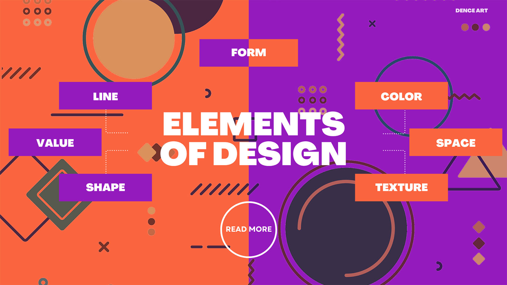
What are the Elements of Design: A Foundation for Creative Expression
The elements of design that graphic designers use to create visual compositions. These basic elements include:
- Line
- Shape
- Color
- Texture
- Space
- Form
- Value
Though simple, these 7 elements allow designers to create an infinite variety of designs. Mastering them is key to becoming an adept visual communicator. Let’s look at each element in more detail.
Line
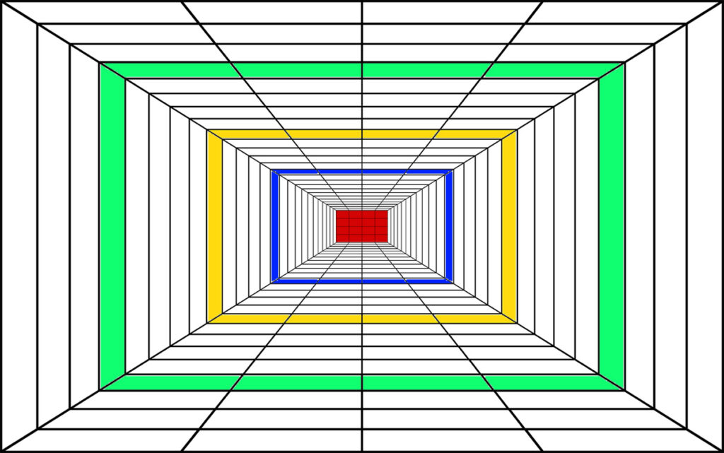
Line is the primary element of design, whether it is vertical, horizontal, diagonal, curved, thick, thin, broken, or continuous. Graphic designers utilize lines as an element in their design. For example, if we have to build a shape then its outer part is a line. We use lines to show the movement of anything. With the help of lines, we can understand many things. Another example is when we go to a railway station, we see that the railway track is following a path, so that is also a very good example of a line. I want to explain lines through this image and look at how lines have been used in the image.
Shape
A shape is a two-dimensional closed line which consists of anything like a circle, square, triangle or an organic. Whether it is geometric or irregular, designers utilize their shape according to their interests, to organize anything or to communicate with some idea. We can make any overlap or any complex thing to make the design dynamic.
Color
Color is considered a very powerful tool kit for a designer. When the colors are combined, we can make a bold statement and we can create a visual hierarchy. It promotes unity and harmony in a design. The designer needs to understand the color theory very well, how color interacts with people and how people like it. Color wheel helps the designers to choose a very good color scheme like complementary, triadic, and analogous colors.

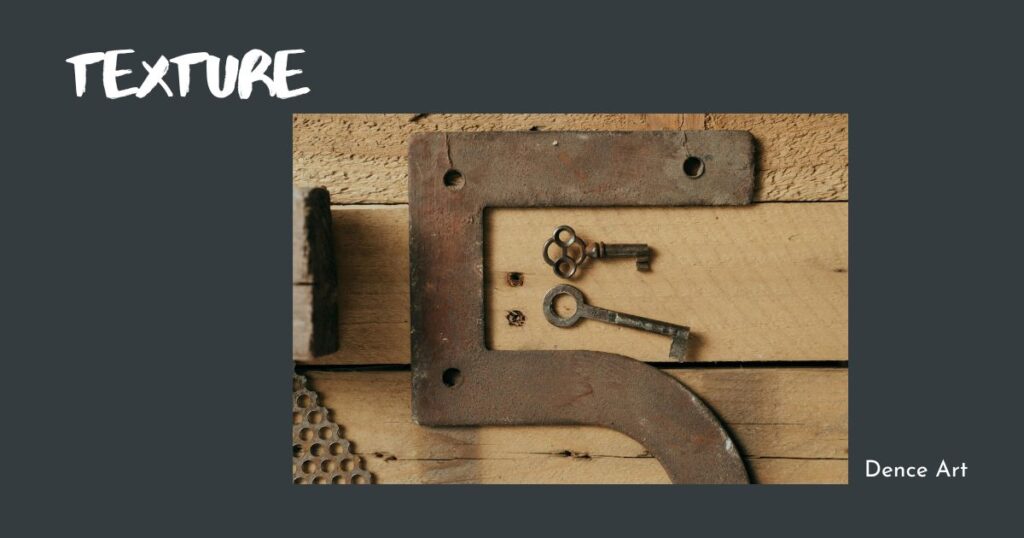
Texture
Texture means how the surface looks and feels, whether it is smooth, soft, hard, glassy, or matte. Graphic designers work with two types of texture, one is visual and the other is tactile texture. Visual texture is visual and cannot be felt. It can become an illusion. They create the illusion of physical texture using principles like scale and direction. Tactile texture can be touched just like sandpaper. Texture is used by designers to show dimensionality and interest in the design.
Space
Space refers to positive and negative space within the design. Negative space separates the elements and makes a design less cluttered. Using a space properly creates balance and whatever is there, you can directly see this composition. Through space, the viewer gets to know about visual rest while helping emphasize the focal point. Designers utilize this element very well in their designs so that they can maximize positive and negative space.
Form
A form is a three-dimensional object that has a height, width and depth. It can be geometric, like a cube or sphere or organic. Designers usually use the form to bring interest and depth to a visual through a technique called shadow and perspective. Simple forms like circles and squares make bold graphic statements. Well, more complex forms enhance realism and dimension in an illustration.

Value
Value means the lightness or darkness of a color. It creates an illusion of form and space by indicating highlights and shadows through degrees of light. Value guides the viewer’s eye, in creating a focal point and visual paths for the scanning of an image. When there is a very high contrast value, it easily grabs the attractiveness of the detail by viewers. Low contrast values are more subtle. The designer adjusts the saturation and Brightness to create a different value.

Summary of the 7 Elements
- Line – Creates visual direction and outlines shapes
- Shape – Flat, two-dimensional closed lines with length and height
- Color – Conveys mood, tone, and meaning
- Texture – Adds physical illusion of touch
- Space – Separates elements and organizes composition
- Form – Three-dimensional object with height, width and depth
- Value – Lightness or darkness of a color
We have come to know what are the seven primary elements. Now we’ll know, how designers can use these building blocks to make their visuals stunning.
How Designers Use the Elements
Mastering the basic elements takes practice but allows designers to make purposeful choices rather than just guessing. Designers combine and arrange the elements on a page in different ways to direct the viewer’s eyes, create a visual hierarchy, convey concepts, and elicit emotion. Here are some techniques designers utilize when manipulating the elements:
- Create movement – Use dynamic lines to guide the viewer through the design. Lead the eye from one element to the next.
- Establish hierarchy – Use contrasting scale, color and space to make certain elements stand out. Lead the eye to what’s most important.
- Communicate symbolism – Use shapes, color and space to convey symbolic meaning non-verbally.
- Direct attention – Strategically place elements and use contrast to draw attention to the focal point.
- Promote unity – Repeat elements like color and line to visually connect elements. This creates cohesion.
- Add variety – Vary elements to add needed visual interest and contrast. Too much unity creates monotony.
- Set a mood – Use color, texture and space to convey the desired tone and feeling.
- Create depth – Use overlapping, size, placement and value changes to add dimension.
- Guide interaction – Use visual cues like color, space and alignment to guide how users interact with a design.
Purposefully manipulating the 7 elements allows designers to have full control over the look, effectiveness, and reception of their design work.
What are all 9 of the principles of design?
While the elements are the building blocks, the principles determine how those elements are combined. The basic principles of design include:
- Balance – Balancing visual elements to create equilibrium
- Hierarchy – Organizing elements to direct the viewer’s gaze
- Contrast – Juxtaposing elements to heighten differences
- Proportion – Sizing elements concerning each other and their surroundings
- Repetition – Repeating elements to tie the design together
- Movement – Leading the viewer’s eye seamlessly through the design
- Variety – Adding visual interest by varying elements
- Emphasis – Making certain elements stand out to become focal points
- Unity/Harmony – Unifying design elements to create harmony
Many principles align closely with techniques for manipulating the elements. For example, repetition relates to unity, and contrast guides the viewer’s attention. Getting familiar with both the elements and principles gives designers the tools to thoughtfully craft their work rather than just throwing elements together randomly and hoping for the best.
The Fundamental Building Blocks of Visual Design
Visual design is all around us: Mobile apps, websites or subway walls tell us everything about visuals, but do you know what is the thing that makes this design appealing? You will get the answer to all these things in the fundamentals of visuals. Designers utilize these core components of visuals to make their designs engaging and beautiful. We’ll break down the key elements every designer should know.
Typography Brings Personality and Clarity
“Introduction to Typography: Understanding Fonts, Styles, and Combinations for Design Beginners”
Typography is the style or appearance of text.
– It is everywhere we look, in books, websites, and everyday life.
– Knowing a little about typography can make a big difference in everyday tasks.
Typography includes serif, sans serif, and display fonts.
– Serif fonts have little strokes called serifs and are good for traditional projects and print publications.
– Sans serif fonts are clean and modern, and easier to read on screens like smartphones and tablets.
Display fonts are best for decorative purposes and small amounts of text.
– Fonts have their language and can convey different feelings or associations.
– It’s important to consider the message and choose a font that fits accordingly.
Consider using alternative fonts to avoid detracting from your message.
– Limit yourself to one or two fonts per project for a cleaner and more cohesive design.
– Utilize different sizes, weights, or styles of the same font to create visually appealing combinations.
Combining different font styles can create complementary designs.
– Experiment with different font styles to find complementary combinations.
– Look to other designs for inspiration and gradually develop a good understanding of typography concepts.
Establishing a hierarchy is key in typography
– Hierarchy helps guide the reader through the content
– Use larger, bolder, or different styles for high-level items
Typography spacing and adjustments
– Tracking is the overall space between characters, which can be adjusted for artistic effect or to fix poorly spaced fonts.
– Kerning is the space between specific characters, varying for the word to ensure proper letter fitting.
Good typography can elevate your design projects
– Bad typography can negatively impact the aesthetics of a design
– Interesting typography can enhance your design skills
The Secrets of Negative Space or White Space
Negative or white space refers to empty areas around elements. It gives the eyes a place to rest, preventing a cluttered look. Negative space also draws attention to the main focus points. Don’t be afraid to use lots of white space – it creates clean, streamlined designs.
How do you combine colors with design elements?
Color is like its own language; it can make you feel things, send messages, and give you a visual personality. The color wheel shows the seven color elements that artists use to find the best palette: hue, saturation, value, temperature, complementary colors, analogous colors, and split-complementary colors.
Color is a powerful design element which impacts the psychology of humans. Different hues evoke different feelings and associations. Red expresses excitement, green tells about nature, and blue tells about trust. High contrast makes specific elements shine and also attracts the eye to key space. If the color is used smartly, the balance and contrast that come together create a pleasing and clean aesthetic.
Through color theory, we come to know how things look and it plays a very important role in generating the visual order that guides us through our eyes. Every artist needs to know about color theory and a painter’s palette. It can be used to highlight variations or to establish the identity of any brand.
shape
Which element of design refers to the surface quality of a shape?
Shapes have symbolic meanings that designers utilize. Circles and curves feel soft and organic, while sharp points and angles feel rigid. Simple, geometric shapes are structurally solid and stable. Organic, natural shapes relate to the real world. The shape is closely linked to color – changing a shape’s color also changes its look and feel.
Texture: A Tactile Journey in Visual
The visual texture of a surface describes how it seems to feel when touched. It makes you feel the physical presence and three-dimensional aspect. Rough, irregular texture reads natural. The smooth, uniform texture looks more synthetic. Tactile texture can be created using patterns, paint effects, bump maps, and brush strokes. Use texture to increase realism and interest.
Elements and Principles in Graphic Design. Why is graphic design so important?
The Elements and Principles of Graphic Design
Elements are the building blocks while principles dictate their effective arrangement in design.
– Elements are the materials used in design, while principles guide their usage and arrangement.
– When applied effectively, elements and principles create an effective visual hierarchy in the design.
Why is graphic design so crucial?
- It gets attention: In today’s noisy society, standing out is crucial. It helps your message stand out and get noticed.
- It clarifies and simplifies complex material, which can be difficult. It may simplify content into useful graphics, making it easier for others to understand.
- It increases trust and authority: A professional and polished design shows that you care about your audience and brand. It helps you appear trustworthy and dependable.
- It awakens feelings. The right graphics may stir up feelings of happiness, enthusiasm, or even nostalgia, making your message more memorable.
- It sells! Eye-catching designs may encourage customers to buy your product or use your service.
Web Design: Blending Aesthetics with Functionality
Website design is a unique thing because it combines auto technologies. A website designer needs to create a user-friendly UI to create a website. This is a trick task.
As an example, when people go to a website scroll through it and click on different things, a designer will have to think about all these very carefully and organize them for ease of use. In a website design, designers utilize elements to organize such as Color, fonts and white space which makes it easy for users to understand.
A designer needs to adapt in this digital world to how interactive his website design. The rule of design says that balance and proportion are still very important for website design. So we got to know this much overall, website design is a combination of the artistic side of visuals with the technical side of user experience.


Conclusion: The Art and Science of Visual
Design fundamentals include line, shape, form, color, texture, space, and value. Though simple on their own, designers thoughtfully manipulate these elements to create stunning visual compositions. Combining the elements with design principles like contrast and hierarchy allows designers to direct the viewer’s eye, establish focus, and convey messages non-verbally. Mastering the elements and principles takes practice but allows designers to make purposeful choices rather than guesses. Understanding these gives designers the confidence to create beautiful and effective visual communication.
In summary, here are the key takeaways:
- Master the Elements: Design’s like a language, built from lines, colors, and more – learn how each part shapes what you see!
- Typography Matters: The choice of fonts and their arrangement can transform text into a visual masterpiece.
- Negative Space is Powerful: Embrace the art of using what’s not there to enhance what is.
- Color Speaks Volumes: Delve into the emotional impact of color and use it strategically to convey messages.
- Shapes Tell Stories: Whether geometric or organic, shapes are the silent storytellers within a design.
- Texture Adds Depth: To build engaging experiences, explore texture’s physical and visual characteristics.
- Balance Elements and Principles: Graphic design is a dance of elements and principles – find the harmony.
- Adapt to Web Design Challenges: Blend aesthetics with functionality in the dynamic landscape of web.
- Harness Color Psychology: Use color psychology to create strong feelings in people.
As you start down the creative art trip, flashback that everything will be important in your artwork. Whatever you’re creating, every line, shape, color, and everything will contribute to your overall artwork. Design principles like balance, contrast, and repetition will guide you in creating a good design. So use all these to develop your artwork to the stylish. To make your creation a masterpiece, you must have a strong concentration.
Also, see my work